Software consistency is a big challenge at many organizations. At Formula X, there were multiple teams (iOS, Android, and Web Responsive) working in silos at different levels of maturity, which lead to wasted time and an inconsistent user experience.
The goal was to create a consistent and cohesive visual design language and UX guideline that unified the experience across platforms for iOS, Android, and Web Responsive.
To get here, I went through the entire design process with additional considerations, such as:
.01 Conducted a visual audit: Took inventory of the css and the visual elements
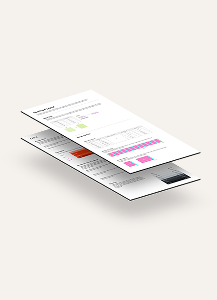
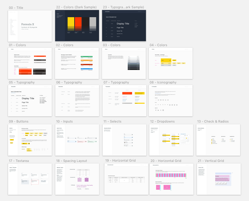
.02 Defined a visual design language: Color palette, typographic elements, grid system
.03 Created a UI pattern library: Merge, remove, and designed new components
.04 Organized Documentation: Reference point for the rest of the team

Reach out to me if you’ll like to get a deep-dive of this project.